VOPlot – The
VOTable plotting utility (Version 1.2.1)
|
|
|
|


Creating data
subsets by applying filters
Statistical
Functions on Plotted Data
Invoking VOPlot
with programmatic interface
Introduction
VOPlot (VOTable Plotting tool) is an applet for plotting different astronomical graphs using data stored in VOTable format. VOPlot is available in desktop version and a web-based version. The web-based version is integrated with the VizieR Catalogue Service and can be used to plot any catalogue by selecting output layout as "Plot (VOPlot)". The desktop version can be downloaded from http://vo.iucaa.ernet.in/~voi/voplot.htm.
Click here for Release Notes and disclaimer information.
About VOPlot
VOPlot has been developed as a part of the Virtual Observatory - India initiative by Persistent Systems and the Inter-University Centre for Astronomy and Astrophysics (IUCAA), in collaboration with Centre de Données astronomiques de Strasbourg (CDS), with a support from the European AVO project. The collaboration between VO-I and CDS extends to several related projects.
VOPlot uses Ptplot 5.2, a 2D data plotter and histogram tool implemented in Java. Ptplot has been developed at EECS department at the University of California, Berkeley.
VOPlot also uses SAVOT (Simple Access to VOTable) to parse VOTable documents. VOPlot makes use of cds.astro (Astronomical coordinate manipulation) classes for projection maps. SAVOT and cds.astro packages are developed by CDS, Strasbourg.
Differences in Desktop and Web-based VOPlot
The desktop version has same functionality as the web-based version except for a feature for saving the plot as an EPS file or as a VOTable file. In the web-based version, there is no menu to load a VOTable or to load multiple VOTables.
Getting Started
Standalone Version:
To use the standalone version of VOPlot, you will need to download the executable jar file named voplot.jar. The file can be executed by typing the following command at the command prompt:
java -jar voplot.jar
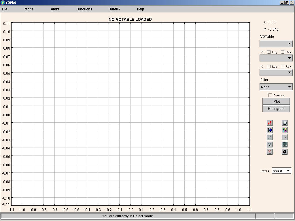
This will open a java application window as shown in the Fig. 0. To use data from a VOTable you will need to load it first. You can specify the path of a VOTable on your personal computer (PC) by clicking on the "Open" submenu from the "File" menu. The message on the status bar will indicate whether the file was loaded successfully or not.
Note : To run VOPlot 1.2.1 you must have JRE 1.3.1 or higher installed. To see the version of JRE installed, type the following command at the command prompt:
java –version
Figure 0
Web Version:
To use the Web-based version of VOPlot for
plotting a VOTable:
1. Search for the required catalogue on VizieR, select a VOTable from the list and select the output layout as "Plot (VOPlot)".
2. After clicking on "Submit Query" button the plotting applet loads. Note: Only numeric columns from the VOTables can be used for plotting.
3. Once the applet is loaded, you can see the numeric fields listed as columns in the dropdown list box.
Figure 1
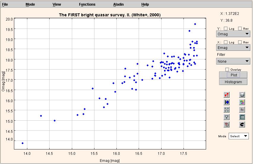
Plotting Scatter Plots
To draw a plot of one columns against the other,
- Select the column to be plotted on the X-axis.
- Select the column to be plotted on the Y-axis.
- Click "Plot" button.
You can see the scatter plot. If required, you can plot data points on a log scale by setting the option appropriately using the "Log" checkbox. Also, by checking the "Rev" checkbox, the data points are plotted on a reverse scale.
Figure 2
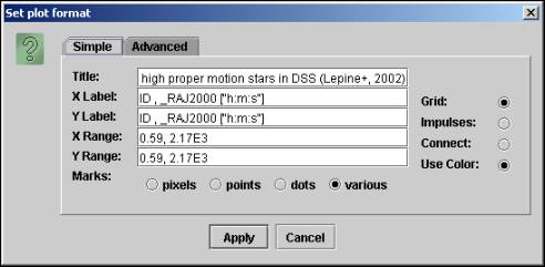
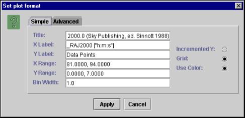
Changing Plot properties
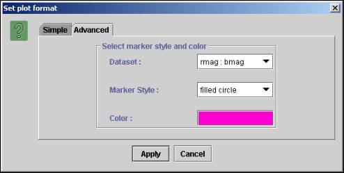
To change the plot properties click on the " View -> Plot Properties" menu, which opens the "Set Plot format" dialog as shown in Figure 3.
For changing properties such as title, labels ranges etc., click on the "simple" tab.
You can choose various marker styles such as "pixels", "points" etc. Setting the marker style to "various" allows plotting with different symbols like triangle, rectangle etc.
Figure 3
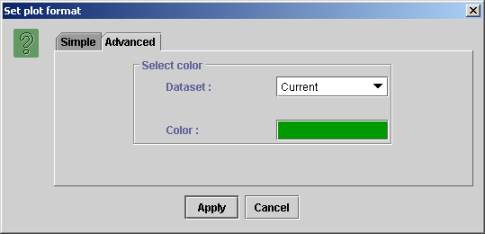
For changing properties like color and marker style click on the "Advanced" tab.
Figure 4
Loading Multiple VOTables
To Load mutiple VOTables click on the "File -> Load Multiple VOTables" menu. Select any other VOTable.
The two columns of the new VOTable which match the current plotted columns are overlaid and plotted on the current plot.
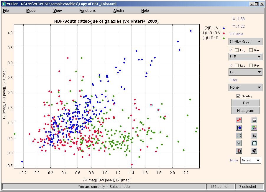
A sample plot with two VOTables loaded is shown in figure 5 below.
Figure 5
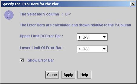
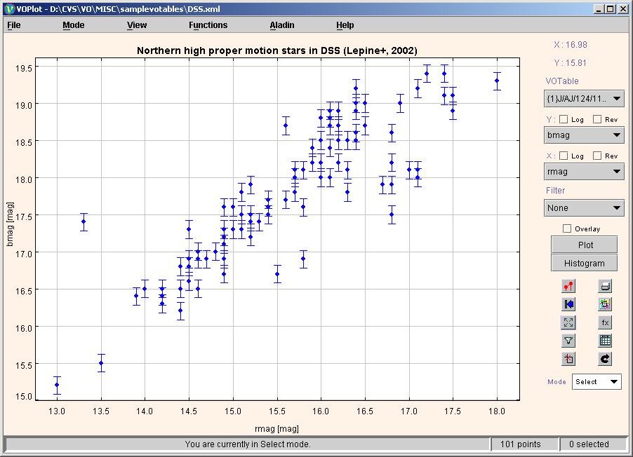
Plot with Error Bars
To draw a plot with error bars, click on the "View -> Plot with error bars" menu.
This will open the Error bars dialog. By default E_ABC(Upper case) or e_ABC(Lower case) are chosen as default columns for the error limits, where ABC is the Y-Column.
If E_ABC contains the error then the error bar is drawn between ABC – E_ABC(The lower limit of the error bar) and ABC + E_ABC(The upper limit of the error bar).
You can choose any other columns as well as for upper and lower error limits.
The Error bars dialog is shown below in Figure 6.
Figure 6
A Sample plot with error bars is shown below in Figure 7.
Note : Error bars are only provided for the column on the Y-axis.
Figure 7
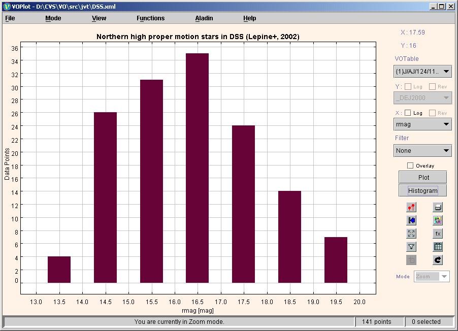
Plotting Histograms
To draw the histogram of a column
- Select the column on X-axis.
- Click "Histogram" button.
A sample histogram is shown in Figure 8.
Figure 8
To plot the histogram bar heights on a logarithmic scale, check the "Log" checkbox corresponding to the Y-axis. If you want to plot the histogram of data points on a log scale, then check the "Log" checkbox corresponding to the X-axis.
When drawing histograms on a logarithmic Y-axis, the bars with height 1 cannot be drawn. You can force the VOPlot to draw such bars by incrementing the height of all the bars by 1. This is done by checking the "Incremented Y" checkbox in the Histogram Properties dialog box
Changing Histogram properties
To change the histogram properties click on the "View -> Plot properties" menu.
Click on the "Simple" tab to change properties like the bin width, X Label, Y Label, range, etc.
Figure 7
Click on the "Advanced" tab to change the color of the histogram.
Figure 8
Zooming
For zooming into the plot you need to be in the Zoom mode. To go in zoom mode, choose "Zoom" from "Mode" combo box or click on the "Zoom Mode" submenu from the "Mode" menu.
To zoom in, drag the left mouse button down and to
the right to draw a box around an area that you want to see in detail. To zoom
out, drag the left mouse button up and to the left. To get the
original graph click on the "Reset" icon represented by ![]() .
.
Select Points
To take the mouse into select mode, choose "Select" from "Mode" combo box or click on "Select Points mode" submenu from the "Mode" menu.
To select points, drag the left mouse button down and to the right to draw a box, the data points that fall within the box area are selected. A square with green outline is drawn around the data point to indicate it is selected.
For multiple selections of points, press the shift key and hold it while dragging the left mouse button.
Unselect Points
To take the mouse into unselect mode, choose "Select" from "Mode" combo box or click on "Unselect Points mode" submenu from the "Mode" menu.
To unselect points, drag the left mouse button down and to the right to draw a box, the data points that fall within the box area are not selected anymore.
Clear All Selections
To clear all the selection on the plot, click on the
"Clear all" icon represented by ![]() or click on "Clear All Selections" submenu
from the "Mode" menu.
or click on "Clear All Selections" submenu
from the "Mode" menu.
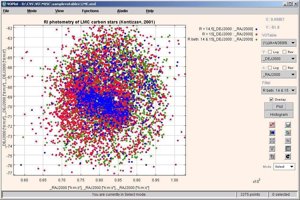
Overlaying Plots
To overlay plots (simultaneously viewing multiple plots with similar range on the same axes system)
- Select column to be plotted on the X-axis.
- Select column to be plotted on the Y-axis.
- Click "Plot" button.
- Select column to be plotter on X-axis (represents another plot).
- Select column to be plotter on Y-axis (represents another plot)
- Set the "Overlay" option.
- Click "Plot" button.
You can see the second plot overlaid on the first one if the second one is in the same range as the previous one. Only that portion of the second plot is visible that is within the already plotted range.
An example of overlaid plots is shown in Figure 9.
Figure 9
To see the plots overlaid together
(even if they don’t lie in the same range) click on the fill icon represented
by ![]() .
Figure 7 shows the complete datasets of all the overlaid plots in the graph
above. A different marker will be used for each plot, to allow one to
differentiate between the plots.
.
Figure 7 shows the complete datasets of all the overlaid plots in the graph
above. A different marker will be used for each plot, to allow one to
differentiate between the plots.
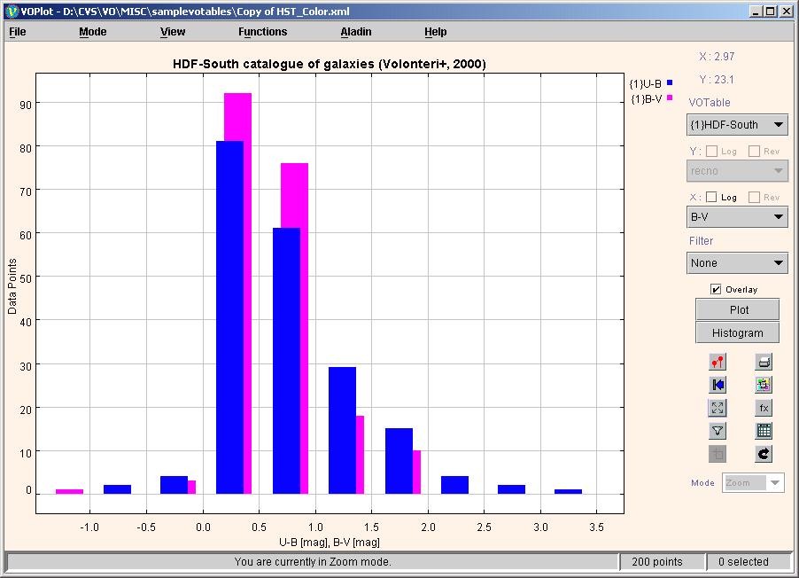
Overlaying Histograms
To overlay histograms (simultaneously viewing multiple histograms with similar range)
- Select column to be plotted on the X-axis.
- Click "Histogram" button.
- Select column to be plotter on X-axis (represents another plot)
- Set the "Overlay" option.
- Click "Histogram" button.
The second histogram is seen only
if it lies within the same X and Y range as the first one. Click on the fill
icon represented by ![]() to see both histograms irrespective of the
range. A different color will be used
for each histogram, to allow one to differentiate between the histograms.
to see both histograms irrespective of the
range. A different color will be used
for each histogram, to allow one to differentiate between the histograms.
Example of overlaid histogram is shown in Figure 10.
Figure 10
Transformations on columns
One can create new columns by defining transformations on them. You can use expressions with arithmetic operators, trigonometric functions, and miscellaneous functions shown below to create new columns. You can use transformed columns for plotting.
Operators Allowed
|
+ |
Addition |
|
- |
Subtraction |
|
* |
Multiplication |
|
/ |
Division |
Functions
|
log(a) |
Log to the base 10. |
|
ln(a) |
Natural Log of "a" with base e, where e is Euler's number (i.e. 2.718...). |
|
pow(a,b) |
"a" raised to power of "b". |
|
sqrt(a) |
Square root of "a". |
|
exp(a) |
Returns the exponential number e (i.e. 2.718...) raised to the power of "a". |
|
dexp(a) |
10 raised to the power of "a". |
|
cos(a) |
Trigonometric cosine of an angle. a = an angle in radians. |
|
acos(a) |
Computes the arc cosine of "a". "a" must range from -1 to 1; the resulting angle is in radians and will range from 0 to pi. |
|
sin(a) |
Trigonometric sine of an angle. a = an angle in radians. |
|
asin(a) |
Computes the arc sine of "a". "a" must range from -1 to 1; the resulting angle is in radians and will range from -pi/2 to pi/2. |
|
tan(a) |
Trigonometric tangent of an angle. a = an angle in radians. |
|
atan(a) |
Computes the arc tangent of "a". The resulting angle is in radians and will range from -pi/2 to pi/2. |
|
toradians(a) |
Converts an angle measured in degrees to an equivalent angle measured in radians. |
|
todegrees(a) |
Converts an angle measured in radians to an equivalent angle measured in degrees. |
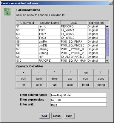
Creating new columns
- To define transformations on columns click on "Create new columns" submenu from the "Functions" menu to display the "Create new columns" Dialog Box.
- In the "Create new virtual columns" Dialog Box, you can see the column names, UCD and their Id (used for expression building) and the expression with which they were created.
- For creating a new column, type in the new column name (example col2) and the expression using the functions shown above. Example: $4+log($6). Add a unit as well for the new column (Optional).
- The expression can also be formed with the help of "Operator Calculator" as shown in the following figure. When you click on a row present in the "Column Metadata" table, then the corresponding Column Id appears in the text box for "Enter expression". By clicking on any of the buttons in the "Operator Calculator", the corresponding operator or function appears in the text box for "Enter expression". This feature eliminates the need of typing in the expression and allows automatic creation of the expression.
The dialog box for creating new columns is shown in Figure 11.
Figure 11
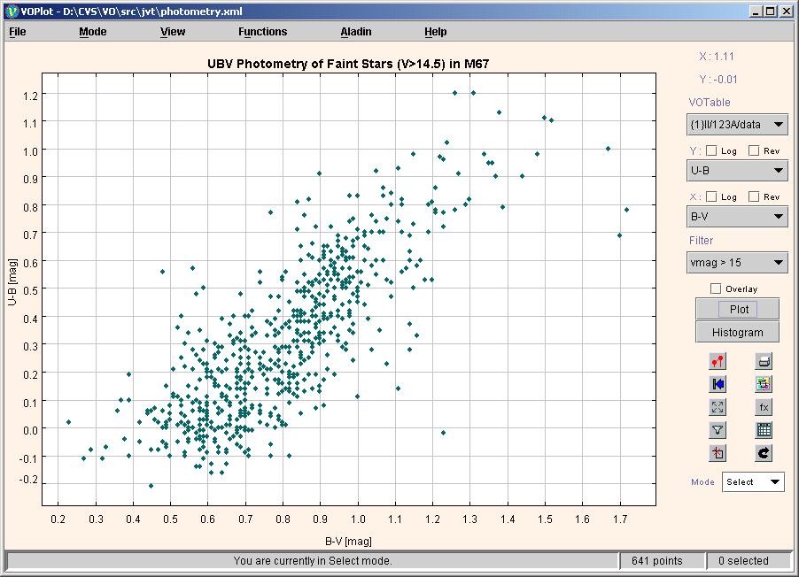
Creating data subsets by applying filters
You can create new data subsets by defining filters on them. You can use a condition with relational operators and logical operators with operators and functions shown above to create new data subsets. Data subsets can be used for plotting.
Operators Allowed
|
< |
Less than |
|
<= |
Less than or equal to |
|
> |
Greater than |
|
>= |
Greater than or equal to |
|
== |
Equal to |
|
!= |
Not equal to |
|
&& |
And |
|
|| |
Or |
|
! |
Not |
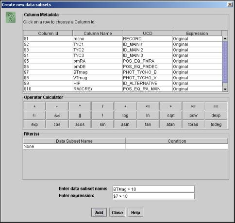
Creating new data subsets
- To define new data subsets on columns click on the "Create Filters" submenu from the "Functions" menu to display the "Create new data subsets" dialog box.
- In this dialog box, you can see the column names, UCD and their Id (used for expression building) and the expression with which they were created. You can also see the data subsets that you previously created with their names and conditions.
- For creating a new data subset, type in the new subset name (example f1Glat) and the filter definition using the functions and relational operators shown in table above. You can also make use for arithmetic operators and functions listed for "Transformations on columns". Example: $1 > 0 || ($3! = 0 && $2 > 100)
- The expression can also be formed with the help of "Operator Calculator" as shown in the following figure. When you click on a row present in the "Column Metadata" table, then the corresponding Column Id appears in the text box for "Enter expression". By clicking on any of the buttons in the "Operator Calculator", the corresponding operator or function appears in the text box for "Enter expression". This feature eliminates the need of typing in the expression and allows automatic creation of the expression.
The dialog box for creating data subsets is shown in Figure 12.
Figure 12
Once a data subset is created you can plot data from the subset. This can be done by choosing the data subset from the Filters combo box in the main applet window.
Note: "All" represents the complete data. Only data points satisfying the filter condition will be considered for plotting.
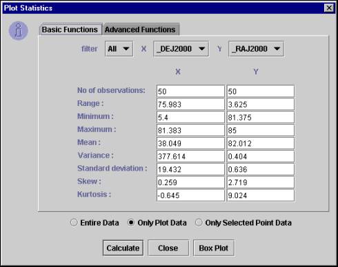
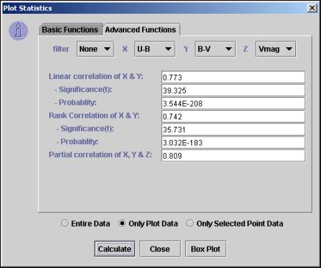
Statistical Functions on Plotted Data
Statistical functions can be applied on the plotted data.
Applying Statistical Functions
- To apply statistical functions, click on "Generate Statistics" submenu from the "Functions" menu. The "Plot Statistics" dialog box will open.
- You can choose the data subset from the filter combo box. Note: "All" represents the complete data.
- Select X, Y and Z axes and click "Calculate" button. Note: Default columns are picked up from the current plot. The results are displayed on the same window.
The dialog box is divided into two tabs – basic and advanced functions. The basic functions require only one data array, while the advanced functions require two or three data arrays as parameters.
The following statistical functions are currently supported.
|
Sr. No. |
Function name |
Input Columns |
|
1 |
Number of observations |
X |
|
2 |
Range |
X |
|
3 |
Minimum |
X |
|
4 |
Maximum |
X |
|
5 |
Mean |
X |
|
6 |
Variance |
X |
|
7 |
Standard deviation |
X |
|
8 |
Skew |
X |
|
9 |
Kurtosis |
X |
|
10 |
Linear correlation |
X, Y |
|
11 |
Significance (t) for Linear correlation |
X, Y |
|
12 |
Probability for Linear correlation |
X, Y |
|
13 |
Rank correlation |
X, Y |
|
14 |
Partial correlation |
X, Y, Z |
VOPlot, by default, takes only the only the plotted data range into consideration while evaluating the statistical functions. This will evaluate the statistical functions for the currently plotted columns, along with the applied filter, if any, in the current axes ranges. However you can force it to consider complete dataset by selecting the "Entire Data" checkbox. Similarly, you can force it to consider the selected data range by selecting the "Only Selected Point Data" checkbox
Sample dialog box with basic tab selected showing plot statistics is shown in Figure 13.
Figure 13
Sample "Advanced Functions" tab is shown in Figure 14.
Figure 14
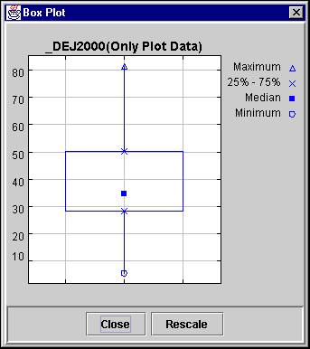
Displaying Box Plot
A Box plot provides an excellent visual summary of many important aspects of a distribution. It identifies the middle 50% of the data, the median and the extreme points.
Click on the "Box Plot" button on the "Plot statistics" dialog to display the Box Plot for the X column.
Sample Box Plot is shown in figure 15 below.
Figure 15
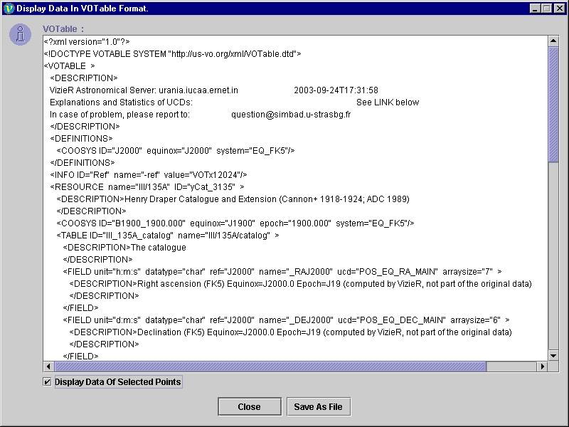
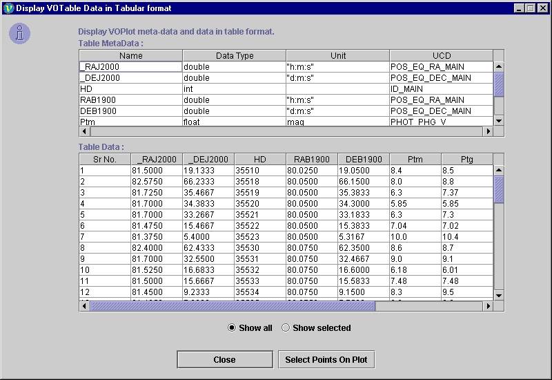
Display VOTable
Used to display Plot data in VOTable format. It also displays the filters and data sets that are user-defined.
Displaying the VOTable:
To view the VOTable, click on "Data in VOTable format" submenu from the "View" menu. The "Display VOTable" dialog box will open.
Selected Data:
The ‘Display VOTable’ dialog box by default displays the metadata and the data corresponding to the selected data points on the graph.
The entire VOTable data can be viewed by removing the selection from the checkbox "Display Data Of Selected Points".
Note: The data displayed is truncated to the first hundred points.
Sample dialog box displaying VOTable containing data of selected points is shown in Figure 13 below.
Figure 13
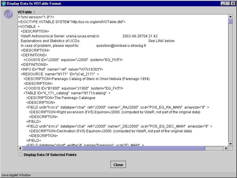
Entire Data:
The ‘Display VOTable’ dialog box by default displays the metadata and the data of the data points on the graph if points are not selected.
The selected points VOTable data can be viewed by selecting the checkbox "Display Data Of Selected Points".
Note: The data displayed is truncated to the first hundred points.
Save VOTable:
This feature is available only in the desktop version of VOPlot. To save a VOTable, click on "Save As File" button on the dialog box. The save as dialog box will appear. Select a file and click on OK. The file is saved as an XML file, VOTable format. The various user-defined filters and data columns pertaining to all points (more than 100) are saved in the file.
Note: This feature is not
available in the web-based version of VOPlot. There is no "Save As File" button
on the dialog box as shown in Figure 14 below.
Figure 14
Display Data
The VOTable data used to plot the graph can be displayed in tabular format. It also displays the filters and data sets that are user-defined.
Displaying the VOTable Data in Tabular Format :
To view the VOTable data, click on "Data in Table format" submenu from the "View" menu. The "Display Data" dialog box will open.
The data is displayed in two different tables. The first table displays the field metadata of the VOTable, while the second table displays the actual data.
If points are not selected on the plot, the entire plot data is displayed.
Sample dialog
box displaying the selected data and metadata of the VOTable is shown in Figure
15.
Figure 15
Selected Data:
To view the data of the points selected on the plot. This dialog box shows data of selected points by default (if user has selected points); otherwise data of all points is displayed.
The selected points data can also be viewed by selecting the radio buttons "Show Selected".
Entire Data:
To view the data of all the points in VOPlot. If points are not selected on the plot, by default the entire data is displayed.
The entire data can also be viewed by selecting the radio buttons "Show all".
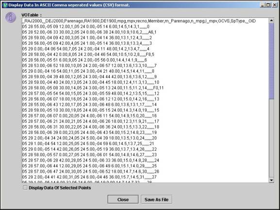
Display Data in CSV Format
The VOTable data used to plot the graph can be displayed in CSV (Comma Separated Values) format.
Displaying the VOTable Data in CSV Format :
To view the VOTable data, click on "Data in CSV format" submenu from the "View" menu. The "Display Data in ASCII Comma separated Format" dialog box will open.
The data is displayed in CSV Format. The first row gives the Column Names for the Data and the subsequent rows give the actual data.
If points are not selected on the plot, the entire plot data is displayed.
Sample dialog
box displaying the data of the VOTable in CSV Format is shown in Figure 16.
Figure 16
Selected Data:
To view the data of the points selected on the plot. This dialog box shows data of selected points by default (if user has selected points); otherwise data of all points is displayed.
The selected points data can also be viewed by selecting the Checkbox "Display Data of Selected Points".
Entire Data:
To view the data of all the points in VOPlot. If points are not selected on the plot, by default the entire data is displayed.
The entire data can also be viewed by unselecting the CheckBox "Display Data of Selected Points".
Save Data:
This feature is available only in the desktop version of VOPlot. To save the CSV data, click on "Save As File" button on the dialog box. The save as dialog box will appear. Select a file and click on OK. The file is saved as an CSV file. This file can be opened in any spreadsheet software (e.g Microsoft Excel) for viewing/editing.
Note: This feature is not available in the web-based version of VOPlot. There is no "Save As File" button on the dialog box as shown in Figure 16 above.
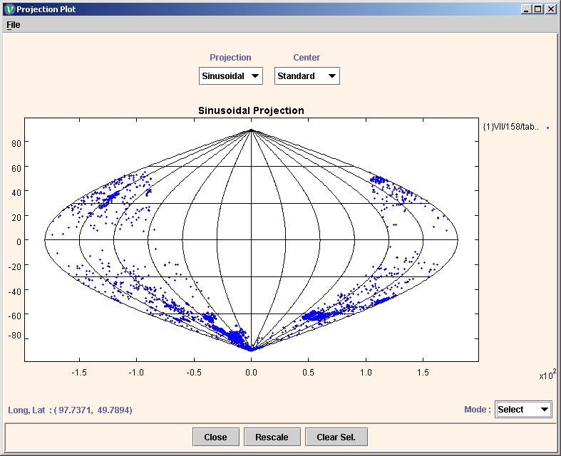
Display Projection Plot
The stars on the celestial sphere are like cities on the globe. While a globe is the most accurate representation of geography, it is difficult to carry around. We have invented flat representations of the globe that, although they distort shapes, areas, and directions are a whole lot easier to carry around. Projections are mappings from this 3D space to a 2D space.
The projection plot for the data plotted in VOPlot can be seen by clicking on "Spherical Projection Plot" submenu from the "View" menu.
For every VOTable loaded in VOPlot there will be a corresponding dataset in the projection plot. Selecting/Unselecting points in the projection plot will also select corresponding points in the main plot and vice versa.
The following 3 types of projections are provided:
- Sinusoidal/Sanson Projection
- Aitoff/Hammer Projection
- Mollweide Projection
Changing the type of Projection:
The projection type change can be changed by selecting the projection type from the "Projection type" combo box from the projection plot dialog.
Changing the Center of Projection:
The center of projection is the coordinates of the center point of the projected sphere. We can see the projected points from different positions such as "Standard", "North Pole" and "South Pole" by changing the center of projection.
The center of projection can be changed by selecting the center type from the "Center" combo box.
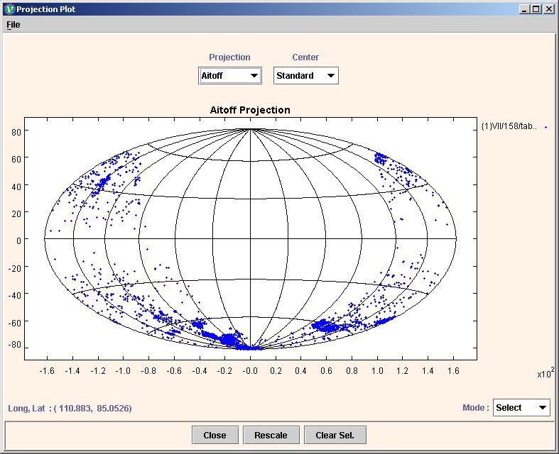
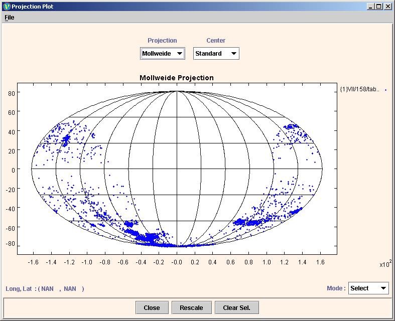
A sample Projection Plot for the above the three projections is shown in Figures 17, 18 and 19 respectively:
Sinusoidal Projection:
Figure 17
Aitoff Projection:
Figure 18
Mollweide Projection:
Figure 19
Saving plot as EPS
In the standalone version of VOPlot, for saving the plot as an EPS, click on "Save As EPS" submenu from the "File" menu. The save as dialog box will appear. Select a file and click on OK to save the image as an EPS file onto your machine. Currently, the image can only be saved as an EPS file.
Note: This feature is not available in the web-based version of VOPlot.
Printing plot
For printing the plot click on "Print Graph" submenu from the "File" menu.
Invoking VOPlot with programmatic interface
The interface provides methods to launch VOPlot from another java application and to manipulate VOPlot.
Click here to see sample java program that invokes VOPlot using "VOPlotExternalApp" interface.
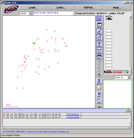
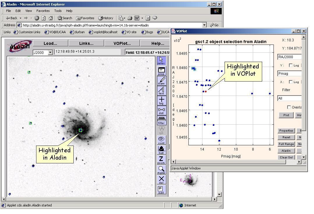
Launch Aladin
Aladin is an interactive software sky atlas allowing the user to visualize digitized images of any part of the sky. It has been developed by Centre de Données astronomiques de Strasbourg, France. Please visit http://aladin.u-strasbg.fr/ for more information on Aladin.
Aladin uses the same data that is loaded in VOPlot. Click on "Launch Aladin " submenu of "Aladin" menu to invoke Aladin. An instance of Aladin will appear as shown in Figure 20 below.
Figure 20
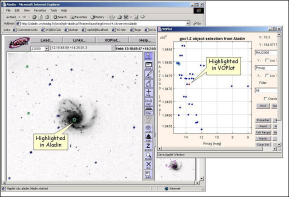
Interoperability between VOPlot and Aladin:
When points are selected in VOPlot, the corresponding objects are selected in Aladin. When the user selects objects in Aladin, the corresponding points get selected in VOPlot. When an object is highlighted in Aladin, the corresponding point in VOPlot is highlighted (the color of the point changes to red) as shown in Figure 21 below.
Figure 21
Feedback Address
We would be happy to receive any feedback/comments on VOPlot. For feedback and comments please contact voindia@vo.iucaa.ernet.in.